A Few Thoughts On Kentucky’s New Logo
The Kentucky Wildcats unveiled new uniforms this week, which makes sense, considering Kentucky changing their uniforms has become more certain than death and taxes. Heck, with this many uniform changes in such a short time, Kentucky football should host the Oscars.
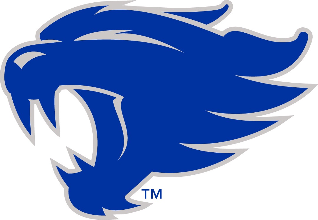
However, with these new uniforms, Kentucky unveiled some new logos. One of which being this distant cousin of Kansas State’s logo, who got weirdly too much into The Grateful Dead.
Here are a few thoughts:
- This logo looks like one of the generic logos you can choose from in the Create A Team feature of an EA Sports video game.
- This is clearly the illegitimate child of Chewbacca and a staple remover.
- This looks less like a wildcat and more like a wet dog with its head out the car window.
- This cat looks fierce and/or like its wincing in pain. The latter being more fitting for Kentucky football.
- This wildcat has got to be a step up from their previous wildcat, who hid behind the UK logo, putting on a front and shouting, “Let me at ’em! Let me at ’em!” Right?
- If the Kansas State logo and the Detroit Red Wings logo mated, this would be its offspring.
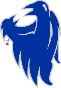
- When you turn this logo on its side, it looks like two birds making sweet, sweet love.
- It’s hard to hate this logo when you realize how difficult it will be to photoshop one of those stupid crying Michael Jordan faces to it.
- The wildcat in this logo has its eyes closed, to commemorate the guy who designed it.
- I think I liked this wildcat better when it was donned on the chest of Zac Efron in High School Musical.
- This logo may not be very good, but just wait until basketball season.


I absolutely hate it, that is kansas city’s logo not KY!!
That is kansas States logo, NOT KY WILDCATs!!!
That’s not KY WILDCATS, that’s kansas States logo. It’s ugly!!