First Impressions of Nike’s 2011 Pro Combat Uniforms
This post is a Guest Post from Steve Halbert. Steve is currently living in Knoxville, Tennessee while looking for a job. You should hire him. He’s funny.
• • •
Nike unveiled their Pro Combat uniforms for LSU, Ohio State, Stanford, Michigan State, Navy, and Army on Tuesday morning.
As I sat at my computer waiting for links to the official release to start showing up on Twitter, I kept experiencing flashbacks to “Kim Kardashian wedding dress finally revealed!” headlines that I kept seeing on news stands. My expectations for both were the same: “Wow, somewhere out there, someone really cares about this…” Now that I think about it, a 2011 Kim Kardashian Pro Combat wedding dress would really complete the collection.
Will the new Pro Combat uniforms change anything for these teams? Probably not, but it’s something to talk about while we wait on week 3 to get here, so let’s put on our fashion-police uniforms (all-white Pro Combats coming soon) and dive in.
First Impressions
Ohio State: New Take On A Classic
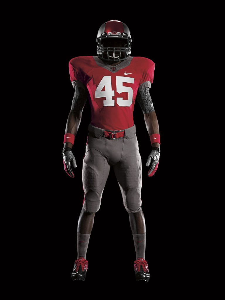
Nike convinced OSU to let them pay homage to the undefeated 1961 Ohio State Buckeyes team, making these uniforms a 50th anniversary set. Although, these uniforms are not an exact throwback to the uniforms worn by that ’61 squad…
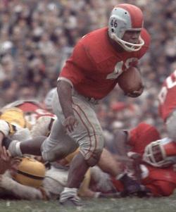
Close enough?
Sure.
Although, I don’t think that the Pro Combat jerseys are nearly as polished and refined as the regular Ohio State uniforms. I mean, why go back 50 years just to look “futuristic”?
A better effect would have been if Nike made the OSU jerseys completely monochromatic so they appeared as black-and-white on television sets around the nation. Is that really the undefeated ’61 team reincarnated? It just might be.
At least they have a reason for the huge red stripe down the middle (ahem, Georgia).
Final Verdict: The regular jerseys are better.
• • •
LSU: All White? Alright.
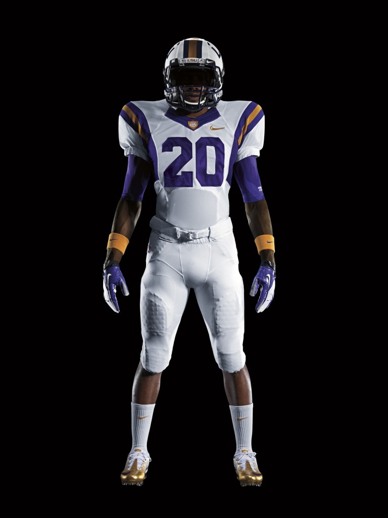
At first glance, there isn’t really that much difference to the LSU jerseys apart from the change from the gold helmet/pants to white. It is hard to argue that the helmet is not the best looking one of this Pro Combat series.
These jerseys prove that you don’t have to go all out and manipulate every color ever associated with a school to produce a successful alternative jersey. I think that LSU will look the best out of all of the schools shown when they take the field against Auburn to premier these jerseys.
My favorite features of the jersey are not even the biggest ones. The cleats, or what I like to call “the Michael Johnson golden miracle shoes“, really set the uniform off and complete the look.
The other jersey modification that has grown on me are the Mega Man gloves.
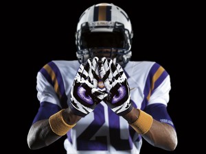
I think a better addition would have been if they gave the gloves purple knuckles and the palms of the gloves read “BAR FIGHT”, but I’m a traditionalist.
Final Verdict: Best Pro Combat of the day.
• • •
Stanford: Red & Black. Where Have I Seen This Before?
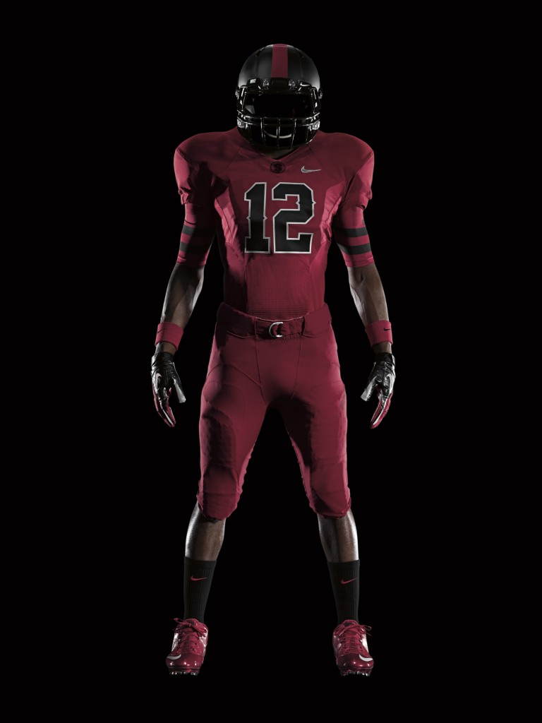
For whatever reason, Nike thinks that everyone’s school colors include black. I get the appeal of black as a menacing color, but at some point it gets old. Georgia, Ohio State, and Stanford all rock a red + monochrome effect this year, which is cool, but played out.
However, I must admit that I am a sucker for the Stanford helmets. Flat black is starting to become Nike’s go-to when they don’t know what to do with helmets for Pro Combats, but they really pulled off something slick with Stanford’s helmets.
The accents on the jersey are pretty cool as well, even though the numbers look more baseball than football. The Dorothy red slippers are also a nice addition.
To be honest, I was looking for a Pro Combat uniform with a little more inspiration from the greatest field mascot in sports. Alas, Stanford completely whiffed on the opportunity to field a whole team of trees, or as the biologists call them, a “forest”.
Final Verdict: Cool helmets, cool cleats, but the black is starting to get old.
• • •
Michigan State: A Force Fed Alternative
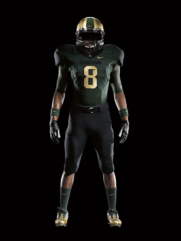
When you think of Michigan State, what are the first two colors that come to mind? You bet your ass they’re black and gold!
Once again, Nike trades in a traditional white for a futuristic black, and adds gold to Michigan State’s colors. When did Michigan State adopt black and gold you ask? It doesn’t matter, Nike’s gonna pimp your uniform Sparty!
The helmets are pretty cool, but the uniform as a whole hardly features Sparty green, and literally no white. What better way for Nike to tell Michigan State that they think State’s colors suck?
I must give props where props are due though, and recognize that Sparty is also donning the miracle cleats. Golden cleat lovers rejoice!
Final Verdict: Despite the fact that the jersey is largely sans MSU colors, the jersey is still pretty cool, and could be a very clean look if their game against Michigan is at night.
• • •
Navy: Where Can I Enlist?
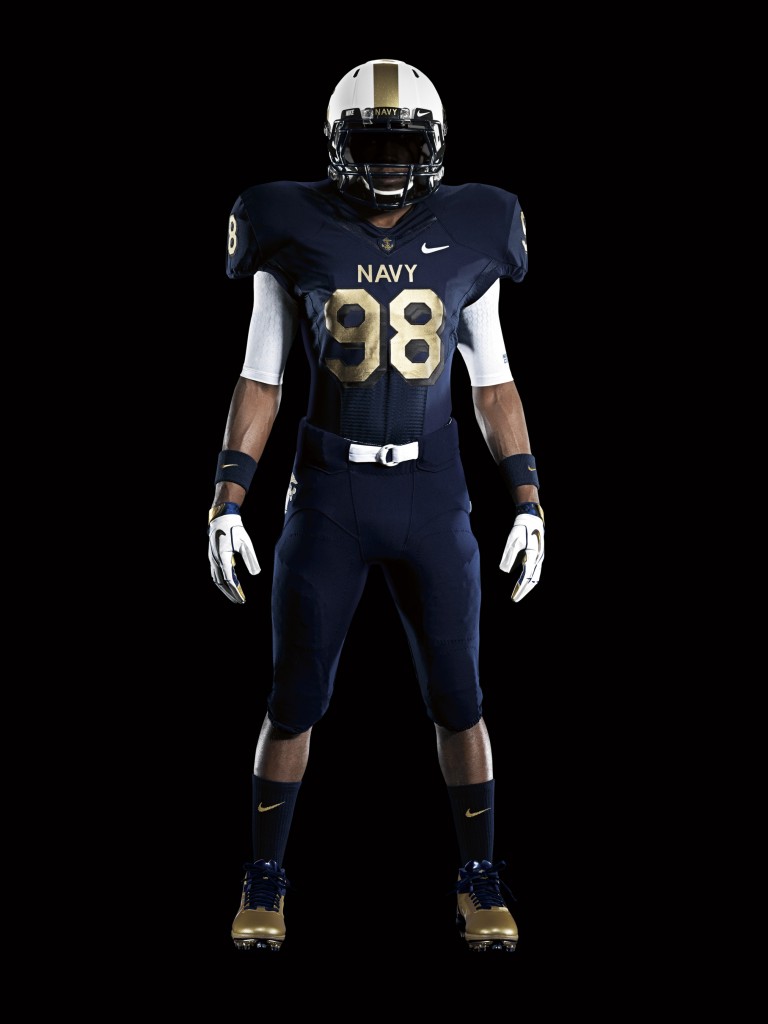
I am a huge fan of what Nike did with the Navy Pro Combats. Nothing too over the top, and everything is properly detailed. Very, very, nice work.
The helmet, gloves, and belt (above) are about as Navy as it gets. Very clean, and very respectable to Navy tradition. For whatever reason, I’m also a big fan of the number design. I don’t usually like a shadowed number, but it works with these jerseys.
Final Verdict: Nike did well with the Navy Pro Combats. Just another reason to tune into the Army-Navy game later this year.
• • •
Army: Outstanding!
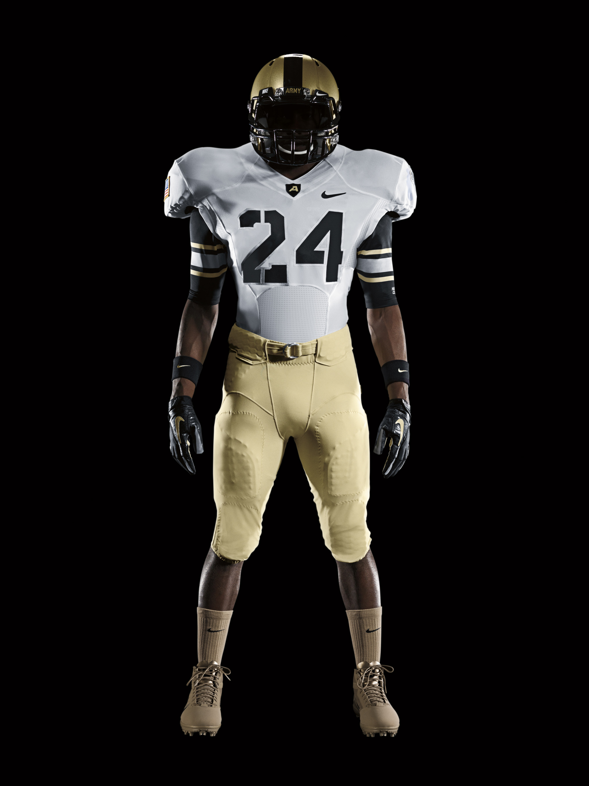
I can appreciate what Nike was trying to do with the Army uniforms.
The jersey is very similar to the uniform that the Army wears, which makes for an instant appeal. The helmet is largely unchanged. The jersey is simple enough, but the numbers definitely drive home the Army look. The socks-cleats combo works very well in mimicking Army boots.
Overall, another job well done in keeping the Army-Navy jersey, and rivalry, traditional and simplistic. I imagined that Nike would have Navy dressed in all grey like a cruiser, and Army dressed in all green like a Sherman tank. They nailed it though, so job well done to Nike.
Final Verdict: Nike didn’t shove anything down our throats on this one, and I can appreciate that. Army should look sharp for kickoff against Navy.
• • •
Final Thoughts On Nike’s 2011 Pro Combat Uniforms
Nike’s vision to be the creative innovator of college football wear is starting to get played out. Like I stated, the red + black/grey combination is starting to wear on the novelty of some of these combinations. Black is a very aggressive color, but I don’t think that these jerseys that feature so much dark color would look that great during a day game.
It is fun, as a fan, to have alternative jerseys for your team to wear, and the players enjoy it as well. These schools knew what they were signing up for when they enlisted Nike to redesign some Pro Combat uniforms for them to wear. Nike sure did deliver in the change department. So like them or not, Nike did succeed in creating new and novel designs for each school.
At the end of the day, you have to be pretty appreciative if you’re a fan of any of these teams that your Pro Combat jersey did not turn out like Georgia’s.
• • •
Want more of Steve and is incredible wit? Follow him on Twitter: @StormTheGate
Or if you enjoyed his writing, check out his website: StormTheGateOnline.com
Also, for up-to-the-minute sports jokes, follow Korked Bats on Twitter: @korkedbats
