Arizona State’s (Sun) Devilish New Uniforms
If you live outside of Arizona or Pac-10/12ish country, when you think of Arizona State University, you immediately think to former Sun Devil great and Waterbed Warehouse king Rod Tidwell. You then probably get the urge to shout out things like, “Show me the money!” or “I love black people!”
The point being: Arizona State has been somewhat off the radar and irrelevant recently. They’re like the Hilary Duff of the college football world.
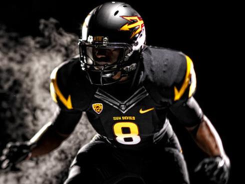
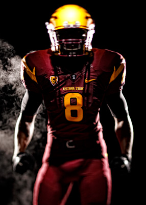
However, your biased preconceived notions of Arizona State Sun Devil football will soon be coming to a screeching halt after you see Arizona State’s new uniforms:
Arizona State hasn’t looked this bad ass since Pat Tillman used to bash skulls all the while showing off a little midriff. (I’ll give you a moment, ladies.)
ASU has done away with their mascot Sparky as their main helmet logo (for the first time since 1947) and will rebrand themselves with the fiery trident… a forkin’ awesome idea, if you ask me.
Currently Penn State fans are sitting at home thinking to themselves, “What’s a new uniform?” So for all Penn State fans (or as their known everywhere else, Amish people) these are what new uniforms look like. This may be a tough pill to swallow considering Penn State thinks even Alabama has outlandish uniforms with those flamboyant numbers on their helmets.
At the same time, Notre Dame fans are asking, “Why do they need new uniforms?” And to that question, we’ll answer with a picture of ASU’s old uniforms.

Point proven. Their old uniforms are as boring as Jake Plummer’s facial expressions. Or Arizona State football. Your pick.
Sun Devil fans, even if Arizona State continues to produce 6-6 seasons, at least now they’ll now be easier to look at.


the new uniforms are awful. nike “design” is the worst thing to happen to college football since…
the trident helmet is a generic, fsu, sdsu, sjsu derivation. it looks like an afl2 logo.
sparky was unique and had character.
thumbs way down on this one.